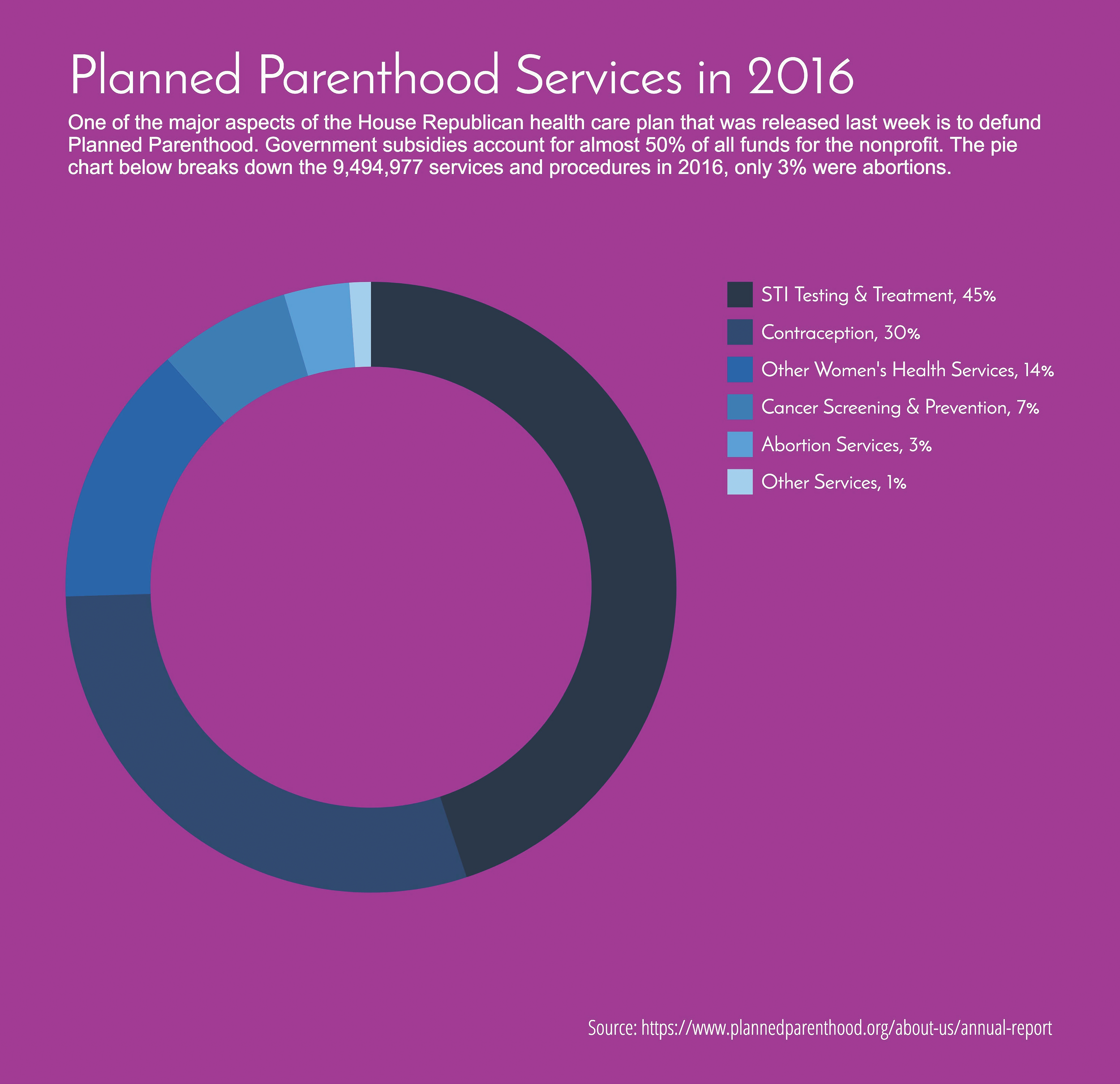
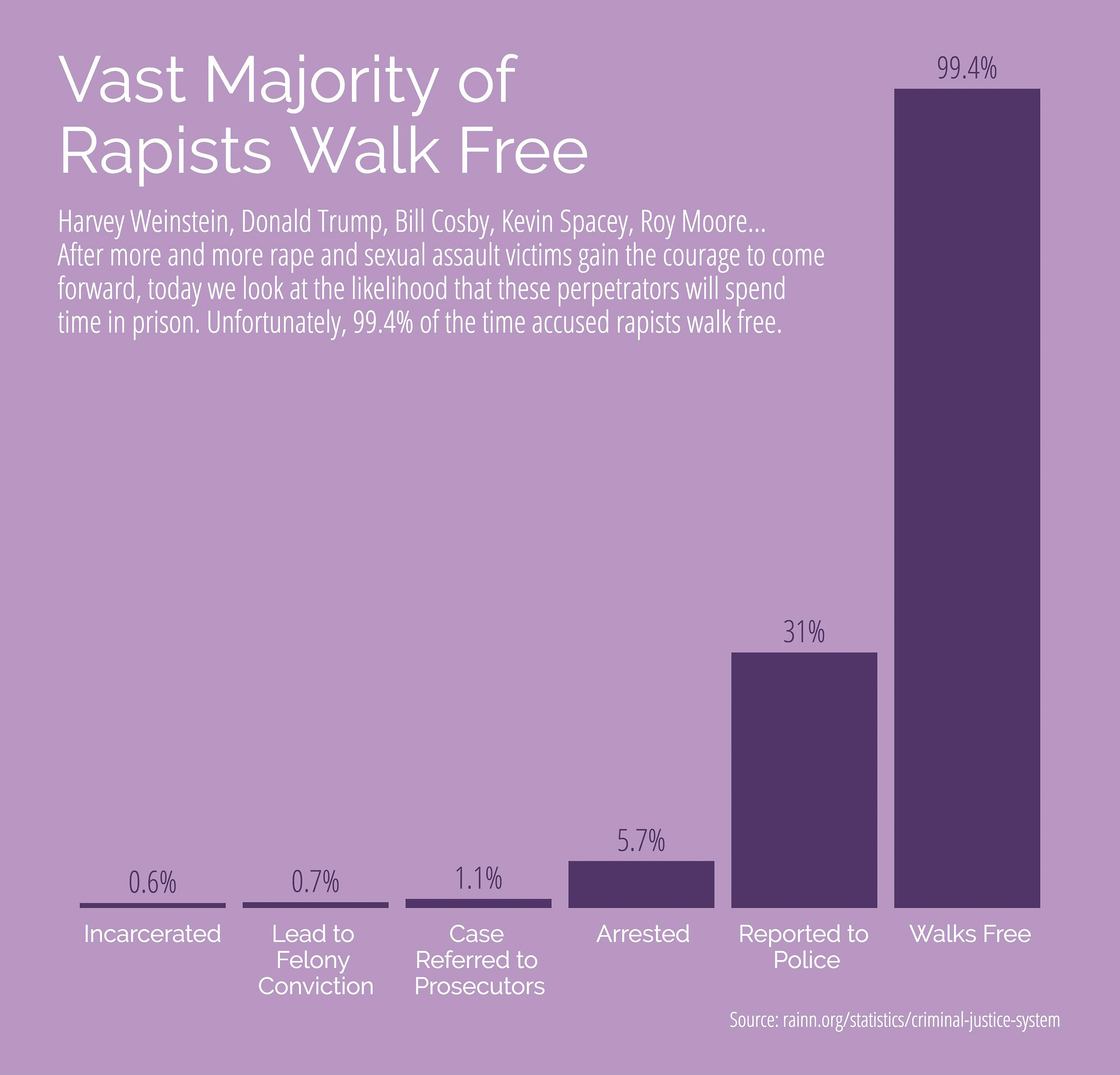
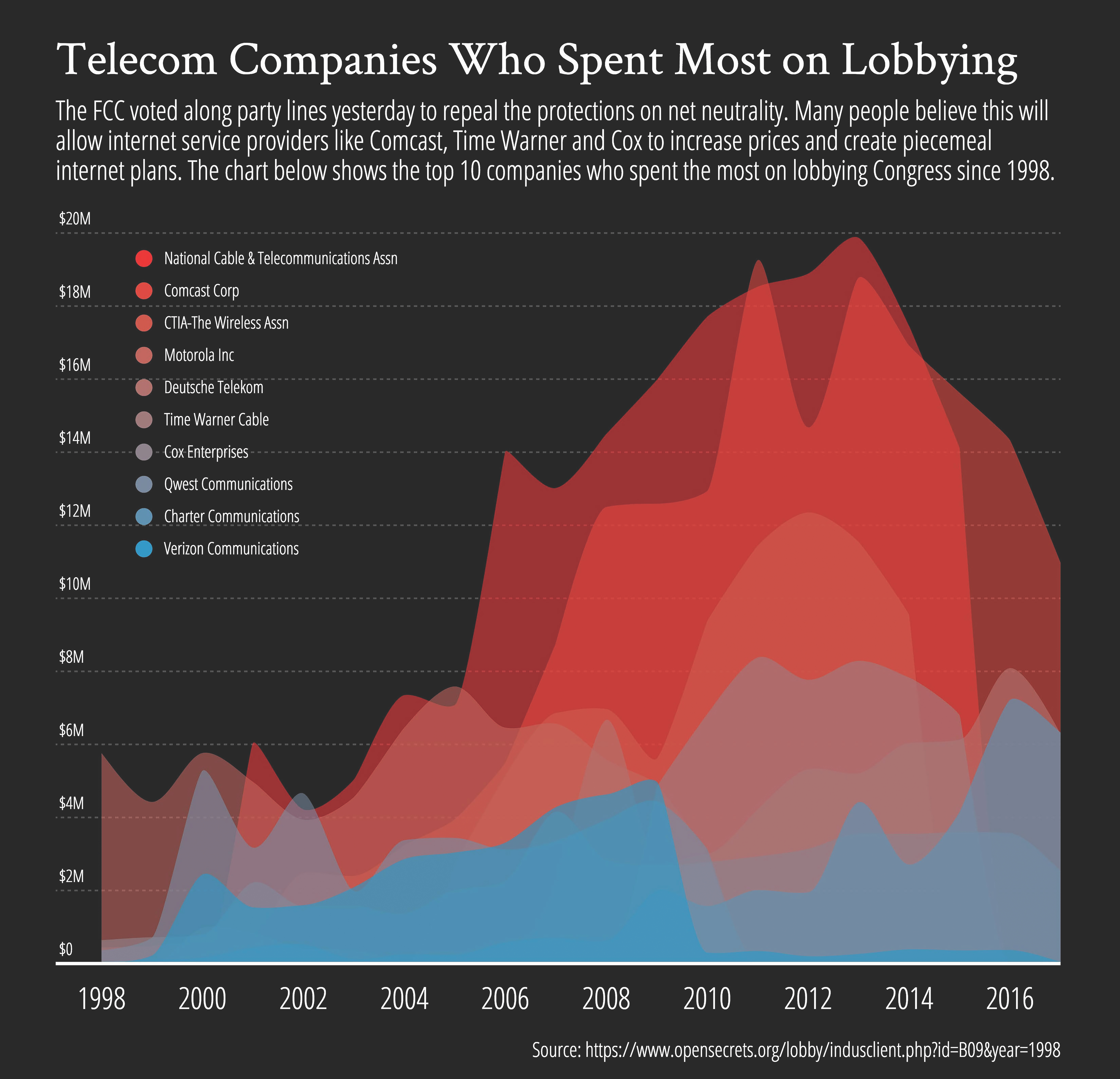
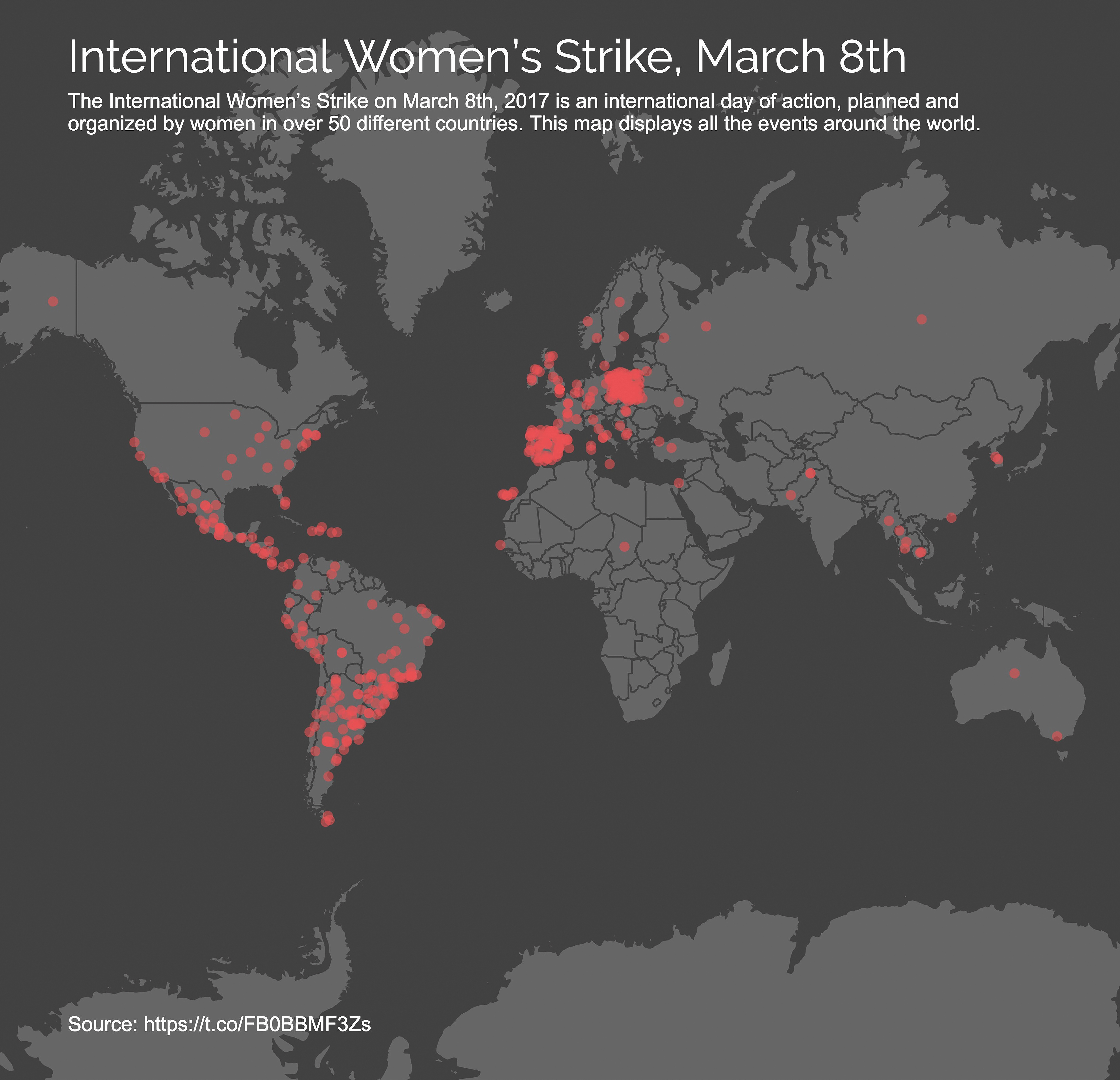
In 2017, I undertook a challenging project to research a daily topic, find data around said subject, and visualize the data each day for the entire year. What started as a way for me to become a super user of a tool I created, Datavisual (datavisu.al), quickly became a way for me to better understand the world we were living in and to share those findings on social media platforms like Instagram (instagram.com/datavisualcharts/) and Twitter (twitter.com/datavisualinfo) through well-designed and straightforward data visualizations.
Designing a unique visualization every day took a lot of discipline! I had to learn new and fast ways to find data sources, analyze the data, and visualize them in easy-to-understand, digestible, and visually-appealing ways. I found all the data I needed for this project online by taking advantage of open data, APIs, web scraping, and searching through PDFs. I used existing tools and software like Excel, Google Sheets, Data Miner, and Tabula and wrote my own scripts using Python and JavaScript to extract the data I needed. To visualize the data, I always used Datavisual and tried to be as transparent as possible by including a direct link to the original data source.
Not only did I learn what it takes to research and technically execute daily visualizations; the process also gave me insight into the future of data and what might lie ahead for the field. Since we were in the midst of an attack on truth while I was doing this project, with misinformation and lies spreading like viruses on all social media platforms, my goal widened to also combating these mistruths. I tried to elevate truth through data around newsworthy topics with the hope that these visualizations would spread farther and minimize the negative impact of the falsehoods. Facebook, YouTube, and Twitter allow information, true or false, to spread like wildfire. This becomes a serious problem when the posts that are wildly untrue or completely misleading gain traction. I hope that a solution to this ever-growing problem lies ahead for the future of data and data science.
I actually started this project with data I collected on myself using tools like the Apple watch, the Apple Health app, and the Gyroscope app that allowed me to better understand my personal habits. Individual control over one’s own personal data seems to be a growing trend thanks to laws like GDPR in the EU and CCPA in the US that allow individuals to gain access to their personal data that’s being collected. Because of these laws, and hopefully more to come, I foresee that people will be able to retrieve their data and opt out of unwanted data collection. This all falls under the data science ethics umbrella, which is becoming increasingly important as more data is produced, collected, and used to both improve society and manipulate its citizens.


Danne Woo is an assistant professor of Interaction Design at Queens College, CUNY in Queens, New York and has been working as a graphic designer, interaction designer, data visualization designer and full stack developer since 2004. He received his Master’s of Professional Studies from New York University’s Interactive Telecommunications Program (ITP) where he focused on data-driven projects, musical innovation, alternative energy, and large crowd interactions. Danne is founder and CEO of Datavisual (datavisu.al), a web-based platform for designing data-driven graphics. He holds the Guinness World Record for his multi-player video game Splat.