This project began with a desire to visualize musical harmony by using additional layers on top of sheet music. Similar to how one can hear the emotional tone of a piece of music or the finality of a strong cadence at the end of a symphony, I wanted to visually see these types of harmonic effects in a musical score. I knew that whatever visual strategies I ended up using, my goal was to mimic how hearing music reveals the most salient aspects of musical harmony, in contrast with how merely seeing a musical score rarely produces that same effect. I also wanted to find methods that could work across different genres of music and media. Could the project’s core, aligning harmonic concepts with specific visual attributes, remain general enough to work across various media and situations? I wanted to build things at a “foundational enough” level so that others could reuse elements of the design in other situations. Looking at using color to define the 12 notes of the scale, for example – could that help someone learn new guitar chords or help to improve their sight-reading skills? Could it help you find a favorite piece of music when paging through a music anthology? Could new visualizations improve accessibility or help someone learn an otherwise very abstract music theory concept?
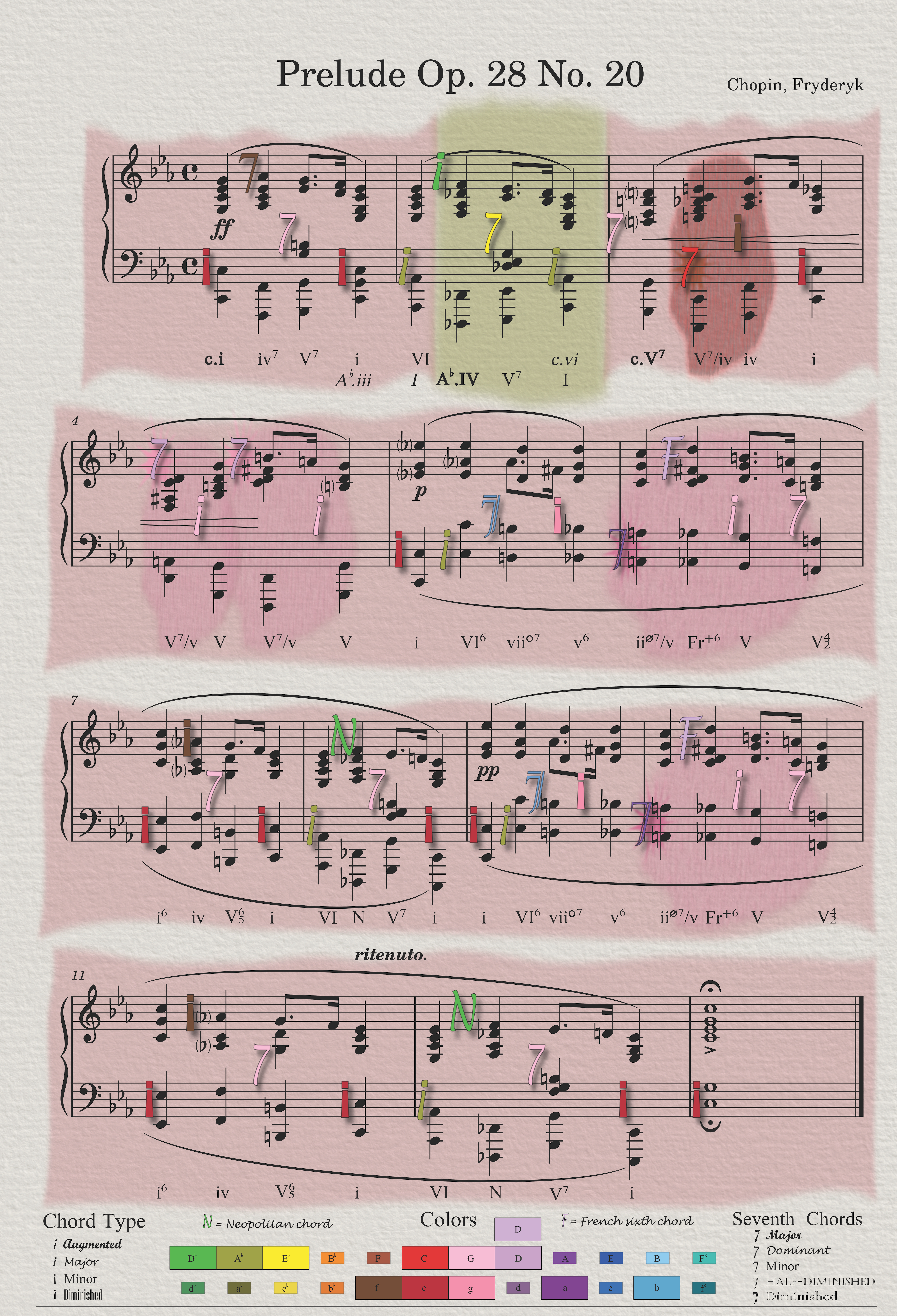
The design makes use of just a handful of key musical-to-visual connections that can be used across many different situations alone or in combination with other visualization techniques. The most obvious is color, which in terms of harmony can encode several elements. Overall, brightness/darkness encodes major/minor keys (what musicologists call “modal brightness”) and different hues each map to the 12 pitches of the scale. Within a particular color-name family (such as “pink,” which would always encode something related to the key or chord of G), there can be different shades and tints to show if a chord is major or minor, as well as augmented or diminished. This is possible because color as a visual channel is underutilized in the large majority of tonal Western art music notation (think black-and-white classical music). By restricting color to clearly delineated sets of color names, we can leverage their familiarity to better separate these color categories. In English, aside from black, white, and gray, these basic color terms are brown, pink, and the six colors of the rainbow (red, orange, yellow, green, blue, and purple). We can expand these eight “colorful” color names to 12 by finding four more colors that are widely recognizable and common enough to be borderline basic color terms themselves (pale blue, teal, olive, and lilac). Since each color category is both visually and linguistically distinct from its neighbor, it’s possible to find two to four shades per color category (think of brown or red or pink, or dark brown vs. light brown). However, using more than two distinct shades per color family requires close attention to color management, and it is not possible with the limited color gamut of some media.
Equally fundamental to categorical colors encoding pitch is the notion of chords functioning as protagonists against a particular environmental backdrop. Harmonically, how we hear a specific chord depends on the surrounding context in which it sounds – is it a return to something familiar? Does it match our expectations or defy them? Does what we hear after make us reevaluate how we first heard the chord? Relatedly, the impact of harmony on a piece of music is often a question of scale. The key of a piece sets the stage upon which everything else must operate until a new key supersedes it (wherever there is a key, of course). Modulations into a different key or modality have a significant effect that generally extends up to the piece’s structure. We can match these aural effects by visually tying the background color, pattern, and edge effects around the staves to that specific key. One level down is pseudo-modulations – functional chords that briefly come close to changing the overall background yet fall short. Being more impactful aurally on the perceived harmony than an individual chord, we visualize this effect through changing the background immediately surrounding the tonicization but not allowing the splash of color to fully extend to the edges. It is like a splash of color within the already present key that fails to displace the key entirely. Glyphs for individual chords are simply a smaller example of this. As a harmonic chord, they exert their own splash of color that is greater than just their individual notes alone (which is why they are made up of a single color rather than three or more colors). Individual notes are yet one step further down this continuum; why not ALSO give them color? Although their 12 pitches govern the 12 color families used for keys and chords (and they are themselves a pure exemplar of the pitch itself), they do not create the same impact over the same time span as a full chord or tonicization, let alone a modulation. They matter, of course, but they don’t play a large enough role harmonically to reveal their own burst of color.
Whether a scale or chord sounds “brighter” or “darker” is strongly tied to whether its third pitch is raised or lowered. I knew at the start of this project that I wanted to extend the treatment of that divide (between major and minor) beyond just the application of brighter colors for major keys and chords and darker colors for minor ones. Inspired by the work that Richard Brath has done visualizing data through text, I’ve tried to use typography and design generally to match several of these musical patterns. For example, key outlines and chord glyphs follow an axis from jagged/more angular towards softer/rounder: Something that is “more” minor, such as a fully diminished 7th chord or the outline around a musical line in the Phrygian mode, would be more angular or have sharper edges than the glyph for a major 7th chord or the outline around a song in a major key. There are several other axes along which musical concepts tend to align, and trying to find the right visual analog for them has made working on this project very engaging. How should one visualize the difference between rhythms made from sets of three versus those split into twos (triple meter vs. duple)? For any visual element, could you match the jaggedness of its edge, its opacity, or its reflectance to something inherent in its musical sound, such as its dynamics (loud or soft), range (low or high), how many individual notes make up its sound (many or few), or the speed of the underlying rhythm (fast or slow)?
This is where I think technology, and data science in particular, can open up new ways of experiencing and interacting with music. While this project’s primary focus is static visualizations of harmony, many more aspects of music could be visualized. All of these representations can benefit from borrowing from the many established visual guidelines from different fields. Adding additional musical elements (such as texture, form, timbre, rhythm, or dynamics) can provide greater depth and richness to a piece and one’s interaction with the music. These elements can all be thought of as separate layers which could be selectively toggled on and off for any given visualization, provided that the underlying medium allows such interactivity. Any layer of musical information, from lyrics and harmonic analysis to section headings or even the notes themselves, can be shown or hidden depending on the viewer’s need. Scores, or their more abstract representations, can be static or animated. Designers could use fonts with variable weight or widths to embed magnitudinal data into text and glyphs. Shapes, patterns, texture, and color can be tied to different musical elements, enabling a broader range of people to experience music’s underlying complexity without the high barrier to access that formal musical training entails.
What perspectives might data visualization practitioners bring to this area that are different from those of musicologists? One example is a focus on showing data so that it can be visually processed, which is fundamentally different from simply reading the individual data points (and critiquing how that data is shown). Visualizations can be more successful when the designer can select visual channels that are a good match to the data they are trying to represent (for example, whether the measures entail magnitude or identity; if their variables are continuous, categorical, or ordinal; or if they are ordered cyclically or sequentially). This helps to explain why text in and of itself is ill-suited to represent, visually, something like the magnitude of a harmonic change (“Just how ‘distant’ does one chord feel from another chord?”) or a chord’s inherent quality (“Does a chord that feels very different from some other chords also look very different?”).
Justin Lind’s research interests sit at the intersection of color theory, visual design, and musicology. He studied music as an undergraduate (mostly classical piano) alongside dance and currently works at Stanford University creating data sets and visualizations of student and faculty data.