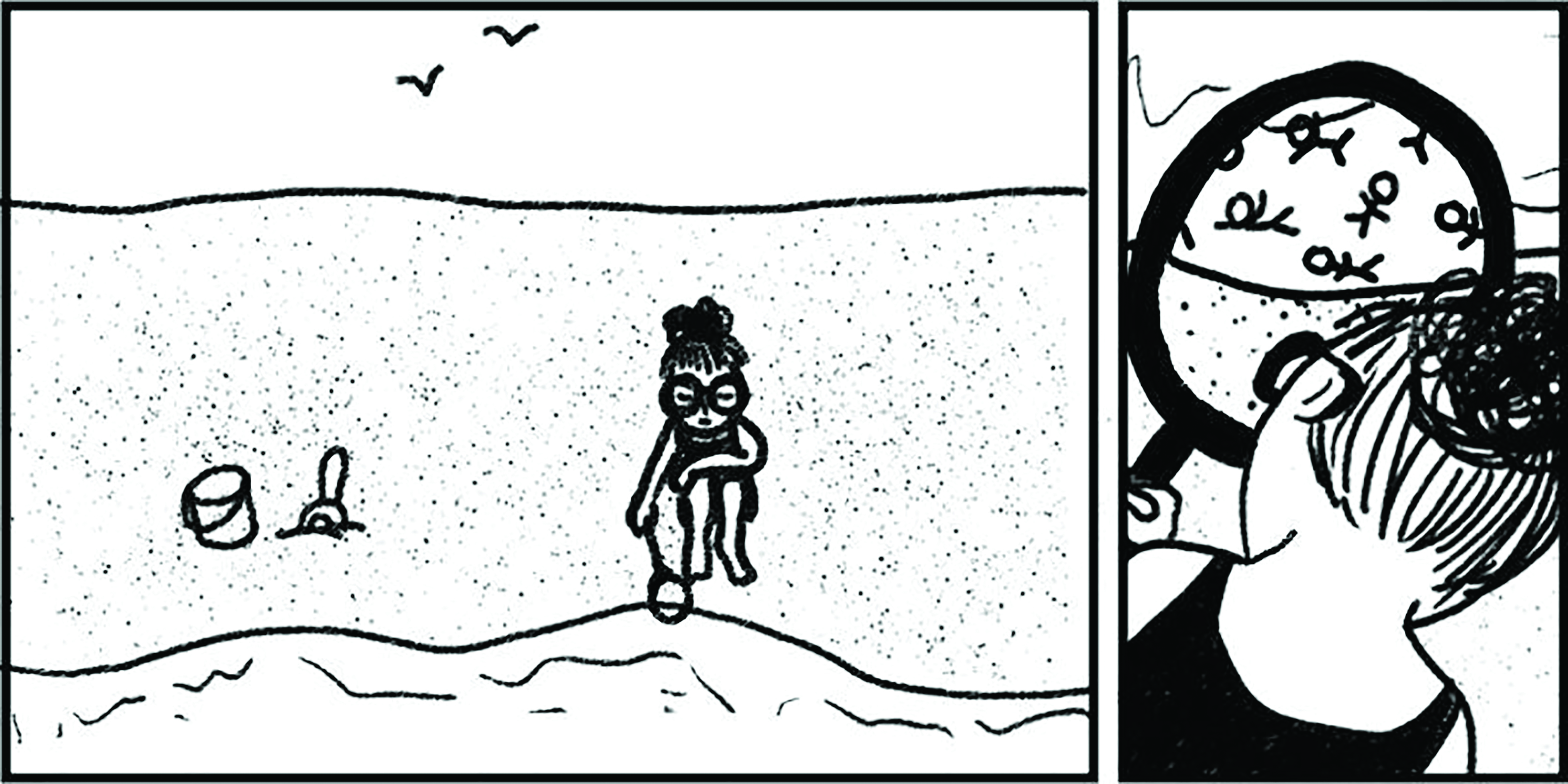
By the time you finish reading this sentence, allegedly 17 MB of data has been generated for every person on earth1. But what does that really mean?
We are “datafied” in one way or another. Our thoughts, actions, and other facets of life are captured, transformed, and quantified into inputs for tracking, benchmarking, predicting, and so on. If we’re not careful, we could forget that the data come baked in with biases or other imperfections. Or worse, we forget that actual living people are behind some of these numbers.
When Singapore (my home country) released its census results in 2021, I tried using a human-centred lens to sift through the data. In the process, I discovered a story about gender roles, marriage, and work.
It wasn’t a story that the official reports and news highlighted as much, so I created a mini-scrollytelling project around it. This scrollytelling project is available here: https://www.alexandrakhoo.com/2020-census-gender-roles/.
Here are the three questions that motivated and shaped my project:
1 When does the status quo prevail for a group, and when does it not?
Asking such questions about the status quo helps us to disambiguate outcomes from the social beliefs and practices propping them up. For instance, women tend to be underrepresented at the higher end of the pay spectrum. The census data also bores this out.
However, if we were to zoom into the data on singles within the top-earning bracket, women become the majority in this subgroup. This difference suggests that depending on one’s gender role, there is some kind of trade-off between married life and work life.
2 Between groups of people, which patterns tend to hold true for some more than others?
Sometimes a norm doesn’t get questioned even if it’s unfair; it’s so commonplace, it fades into the background. Contrasting across categories of people casts this reality into sharp relief. It’s similar to using a ‘gender-flip’, like switching the superhero outfits and postures of men and women in comics to highlight the oversexualisation of the female body.
In my project, by showcasing how people’s most common reasons for not working differs, it spotlights the disproportionate weight of household duties that women in Singapore continue to bear.
3 Which groups of people are not so visible in the dataset?
Even in something as comprehensive as a census—a detailed demographic breakdown of people living in a country—the categories used can restrict which identities get attention. When a dataset differentiates only between ‘men’ and ‘women’, nonbinary people are missing from consideration. Or if households are categorised as belonging to a single ethnic group or another, where is the space for interracial couples and families?
A similar risk of exclusion applies when we don’t consider minority groups along other identity lines. People serving roles outside of the current norms may get sidelined in public policy considerations—male caregivers and their access to paid family leave, for instance.
What if, instead of treating data as the ‘new oil’, we pause and ask, How can we humanize data? Further, how can we use data to shed light on how power and privilege operates when the data itself is an artefact of an unequal world? Works like Catherine D’Ignazio and Lauren Klein’s Data Feminism and Jer Thorp’s Living in Data have been valuable resources for me in navigating these data-related decisions. Admittedly these aren’t easy questions, but they are a start in imagining and working towards a more equitable future.
Alexandra Khoo is on a mission to bring clarity to the complex as a strategist, analyst, and dataviz designer. She shares data stories on her website at www.alexandrakhoo.com. When out in the real world, she can be found bouldering or hanging on gymnastics rings.
1 The Lowy Institute. Big Data. https://interactives.lowyinstitute.org/charts/the-interpreter/big-data/.